BANDERSNATCH
2016 American Architecture Award, Chicago Athenaeum Meuseum of Architecture and Design and the European Centre for Architecture, Art, Design and Urban Studies
2015 Citation Award, American Institute of Architects NextLA Awards
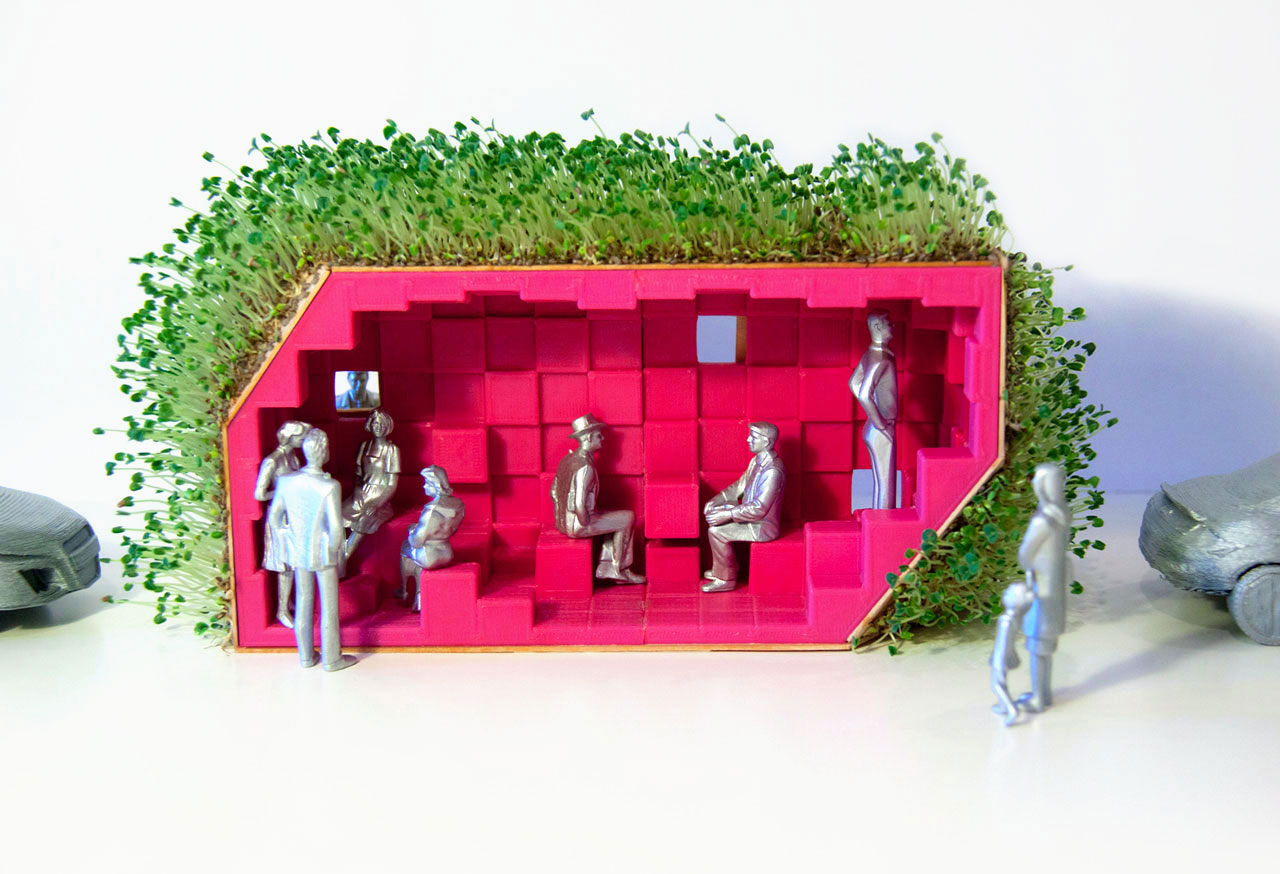
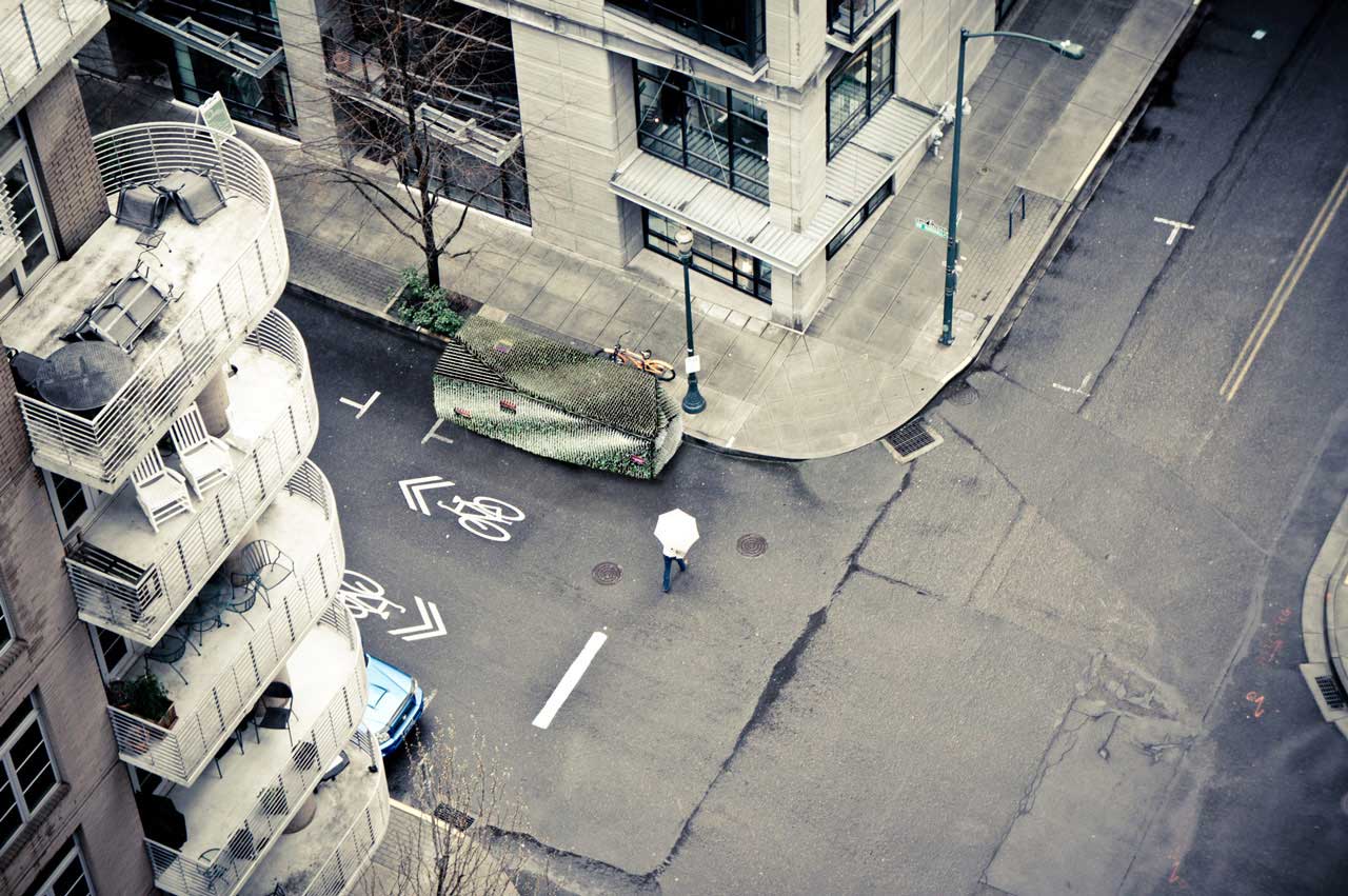
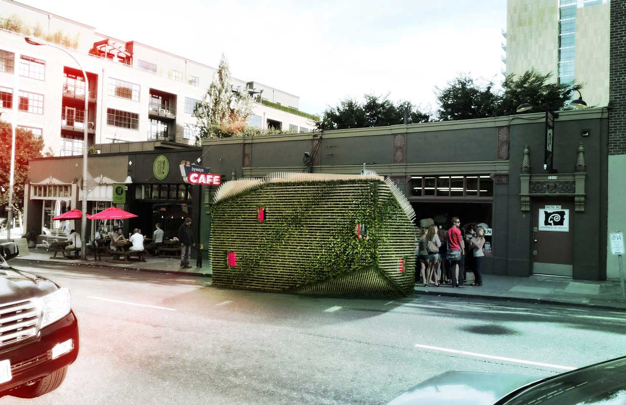
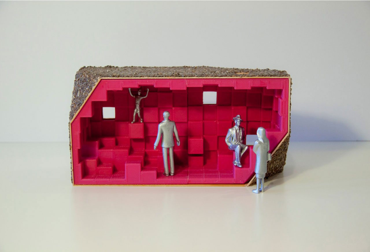
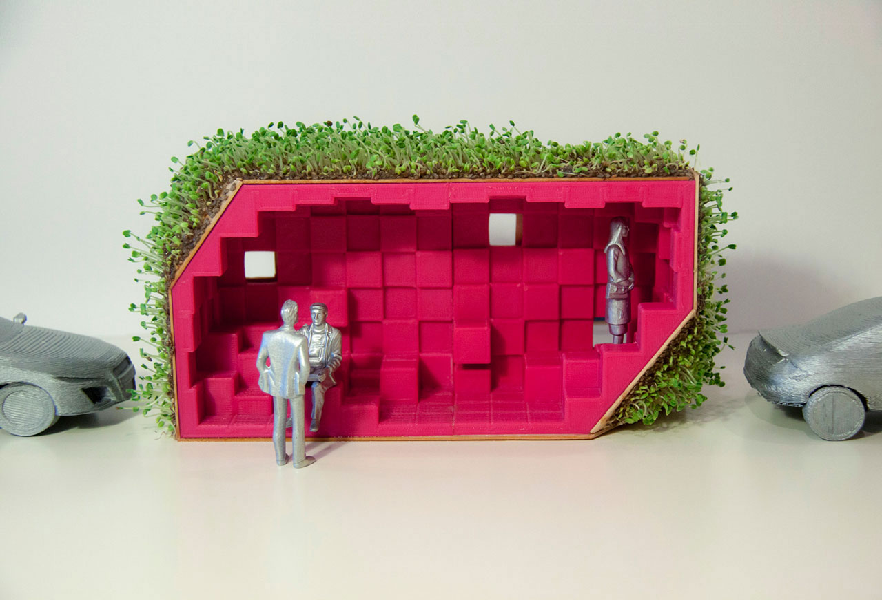
Bandersnatch is a mini-monumental floating signifier, one that humbly offers a spot to come in from the rain.
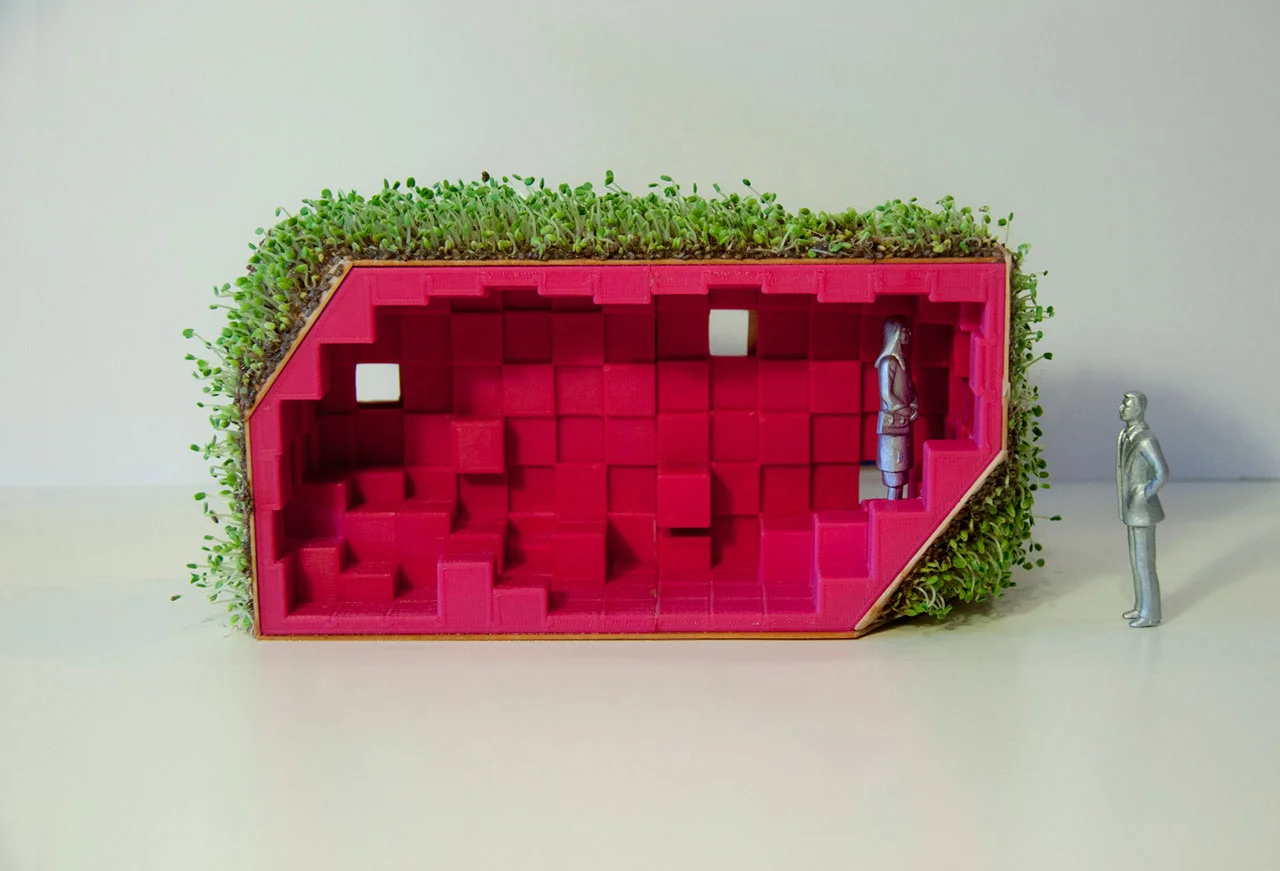
This pop-up parklet (designed to occupy a standard parallel parking space) winks at the postmodern project of textual communication, choosing instead to drop hints sub-linguistically via memory and free-association. Neither entirely hedgehog, camping trailer, pin cushion, pinecone, geode, nor Chia Pet, it is a little bit all-of-the-above (and then some). Representing and indexing nothing, it absorbs rather than emits meaning, welcoming diverse interpretations.
Named after a mysterious critter in Lewis Carroll’s nonsense poem ‘The Jabberwocky,’ Bandersnatch is emphatically anti-prototypical. It dwells in the liberated territory of the one-off, certain that heterogeneity is fundamental to the success of the parklet concept. We would not recommend a Bandersnatch roll-out. Though a tiny bit stubbornly individualistic, this oddball critter is polyamorous, welcoming diversity and soliciting odd encounters.
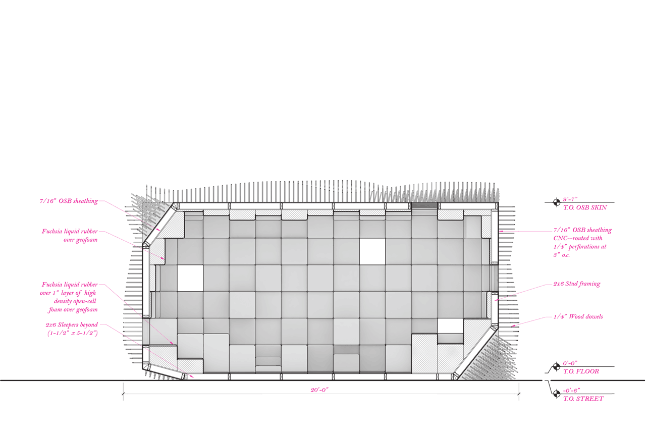
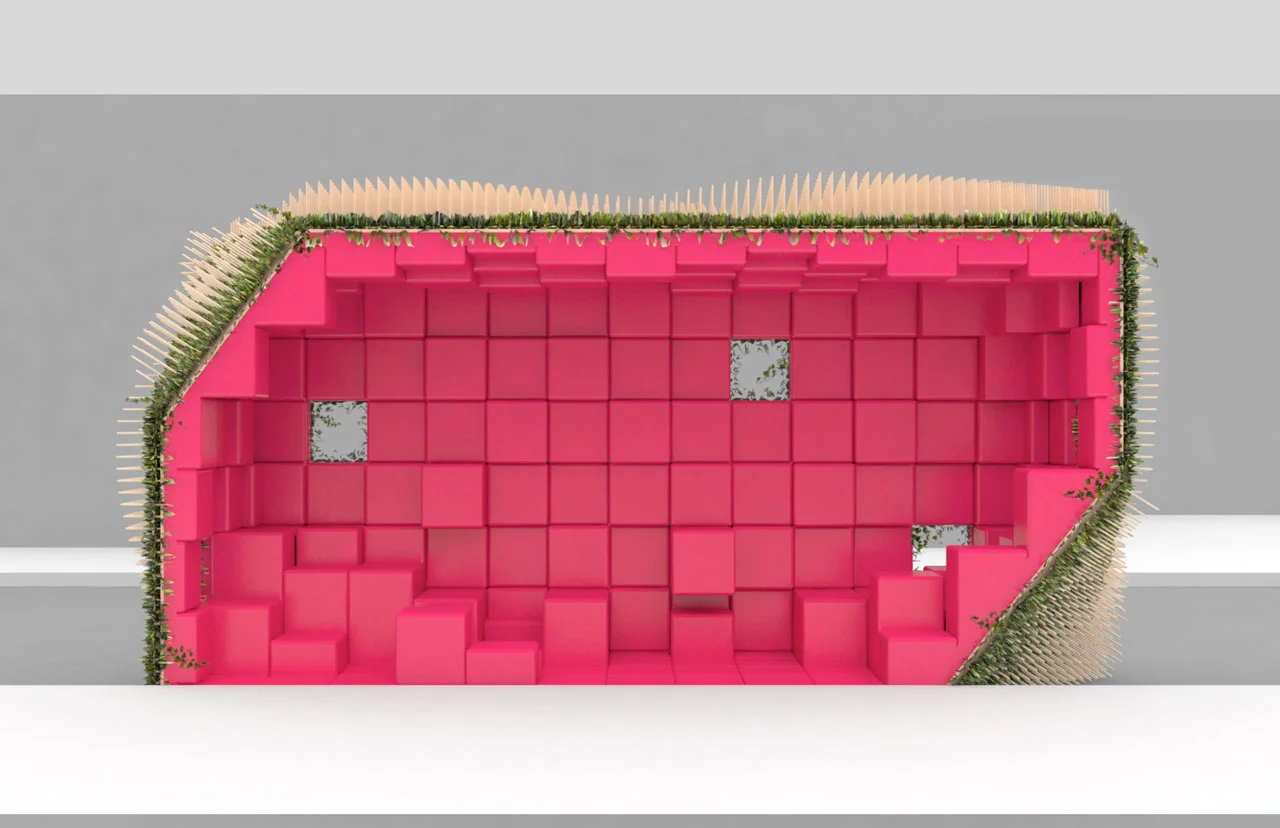
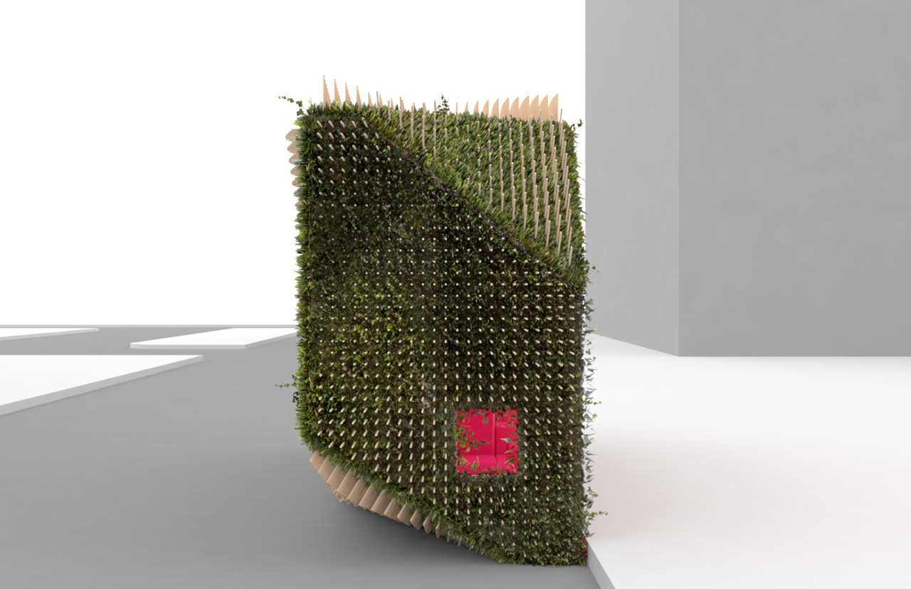
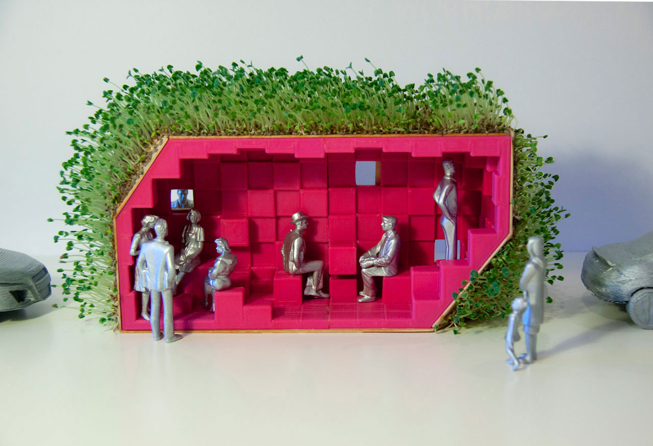
Instead of sequestering softscape within timid planters, Bandersnatch invites a super-sized vegetal takeover. ‘Planters’ are nominally included herein to satisfy Department of Transportation guidelines, but these nodes act as a springboard for broader, more encompassing and vivacious growth. An array of wooden ‘quills’ describes a curvaceous second skin that is both sensuous and bristly, but its true origin is more pragmatic: rather than being forced to patiently wait for climbing vines to become fully established, these ‘quills’ allow more mature plant life to be ‘pre-strung’ from the recessed root nodes and across the project’s prismatic form.
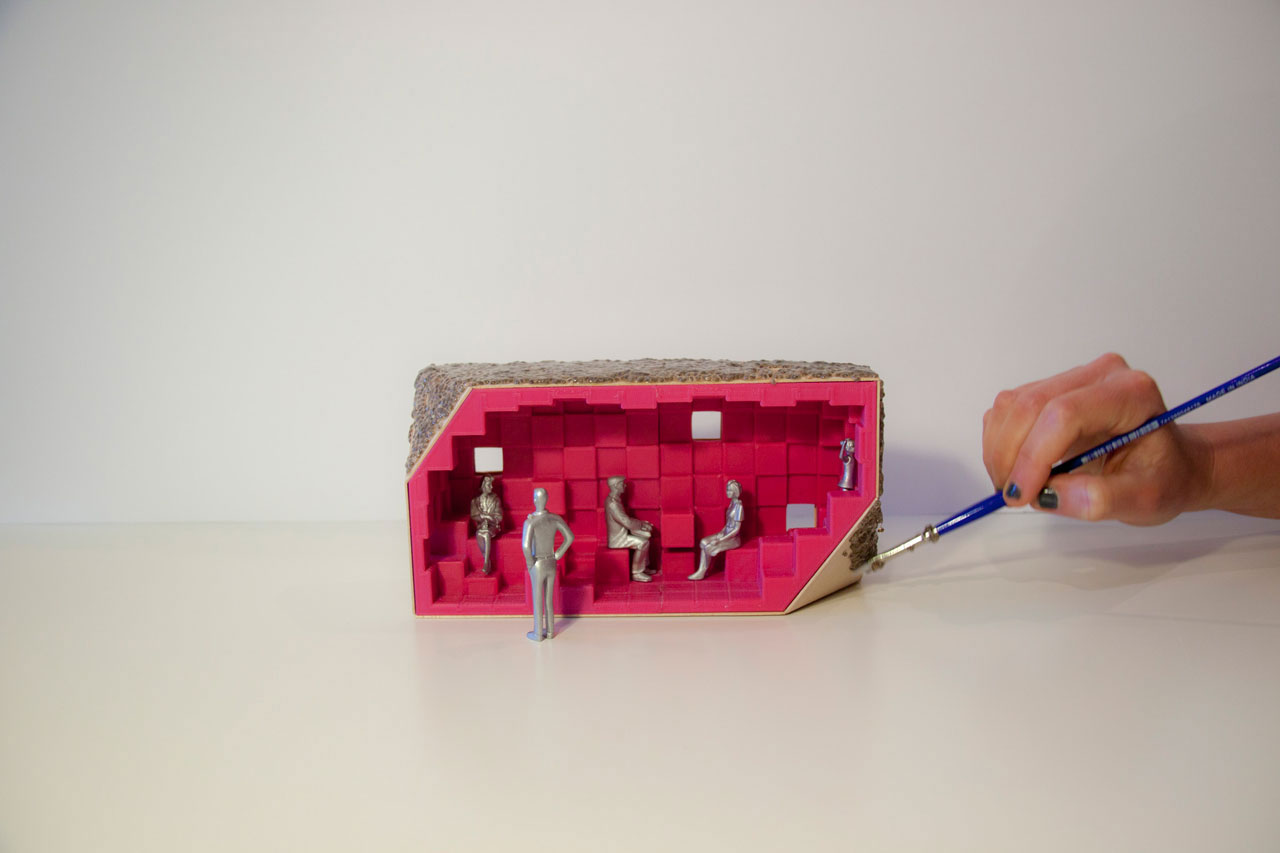
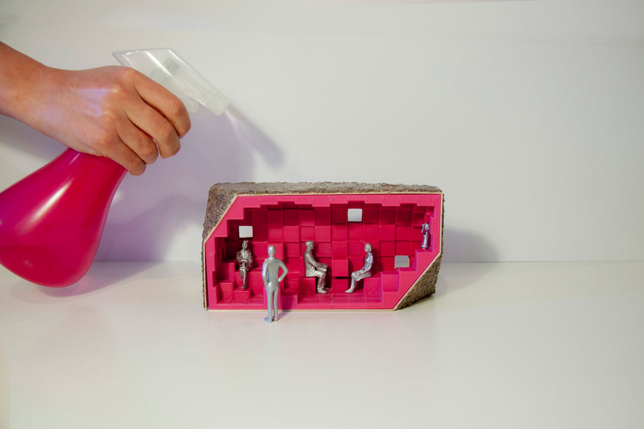
Bandersnatch revels in to-be-looked-at-ness. Cleaved open at the sidewalk’s edge, its proscenium entry renders the theatre of the sidewalk exuberantly explicit, engendering reciprocal relationships between performer and viewer. Its interior surfaces, coated in a ubiquitous membrane of fuchsia liquid rubber, offer a radical chromatic and tactile departure from both hardscape and softscape, producing a new third space. The hyper-encompassing and highly synthetic visual quality of the interior attempts to decontextualize and reframe the city beyond. Much as the white walls of the gallery elevate the 'ready-made' to an object status that invites close reading, Bandersnatch seeks to shake us just a little bit outside of our comfort zone and heighten our awareness of the wonderful spectacle that is urbanism.
PROJECT: Bandersnatch
TYPE: Urbanism
YEAR: 2013
TEAM: Devon Montminy, Cori Gunderson
TAGS: Installation, Landscape, Urbanism

